Jill McCracken website
- Who
Award-winning soul singer-songwriter Jill McCracken
- What
Website to improve content management while increasing fan engagement
- How
Creating a destination for resourceful visitors and avid fans alike
- Impact
"Since the rollout, I have not only just booked more shows, but more of the elevated types of opportunities that I really want."
- Creative direction
- Art direction
- UX/UI
- Development

The brief
Jill McCracken is an award-winning singer and songwriter producing in a raw, retro soul style that plucks threads of nostalgia to serve their authentic feelings. Their work has been featured regionally and nationally, with multiple solo and band-backed tours delivering performances that fill venues and hearts. In their own words, “I’ve always been a lot: big ideas, high standards, and a loud voice.”
Jill was frustrated with the circumstances of their current web channel and how, as both an artist and a brand builder, it had painted them into a box. Managing its content was difficult, its capabilities limiting, and its experience—an essential factor for their art—was entirely disconnected in scope and standard to their state of craft. The goal then: delivering a website that unlatched Jill’s creative trap while offering a compelling venue for visitors to discover.


Defining a destination
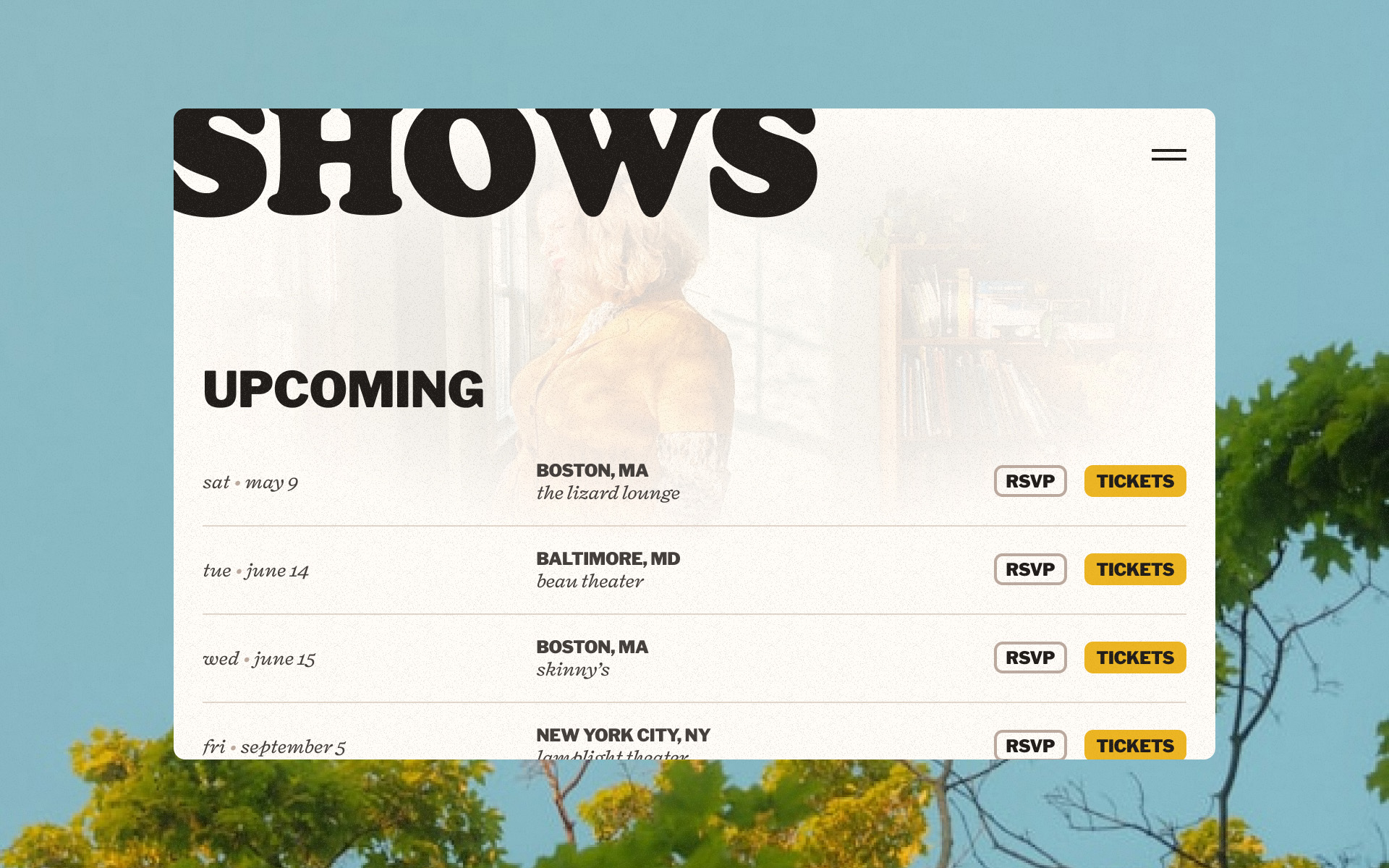
When we started the project, initial surveying revealed that musicians’ websites tended to be simple waypoints bouncing visitors away to more helpful places, such as for ticket sales and merch eCommerce. We decided Jill’s should be a destination: an alluring garden where fans can step into a world under their control.
Essential to this strategy was creating a platform for content not available anywhere else. A music library was built to house Jill’s select discography, including lyrics, artist statements, and our idea of “pairings” where Jill’s whims, suggestions, and situations for each track were included as journal notes and sketches.
The CMS system itself is constructed for simplicity and flexibility, breaking down update tasks with clear actions and language to give Jill or their team time back to focus on the content creation itself. The site includes automated population for BandsInTown postings, simplifying ticketing without the need for CMS support. An editorialized about page gives readers deeper insight than most music websites divulge. And featured areas around the site give Jill opportunities to promote other revenue streams, such as their Patreon.


A dichotomy of style
As an artist, Jill’s tastes naturally were strong and complex. After discussions of their own process, inspirations, and visual output, we defined a creative direction that gleefully combines the maximalist drama of 70’s era pop media with the intimacy of shared literature. The concept recognizes the many contrasting poles in Jill’s expression and offers visitors the emotional range of their musical palette.
Physicality was an important factor in site’s art direction. Pages feel large and poster-like. Typefaces were chosen for their period connotation and their use is inspired by Jill’s own habits, such as their penchant for lowercasing in longform. Buttons smudge like stickers being set. The music library combines ideas from gig posters and record cabinets, transforming the UX of a typical list into a moment of digital crate digging. Like reading back cover of a spinning record, texture, color, orientation, interaction, and layout all contribute to a tactility that enhances the musical experience for fans and casual listeners alike.


All-access pass
The result is a place for revelry at any volume—for Jill, their art, and their community. The website gives Jill a central place to advertise new releases, update fans with tour information, and offer dedicated listeners ways to deepen their connection. Audience reaction to the launch was overwhelmingly positive, excited by the new art and content, and Jill felt they gained a platform for her work that equally felt of their work.
To say that Asher upgraded my music website would be a massive understatement. Asher’s brilliant concept, design, and execution sets my website apart in a sea of independent artists. Since the rollout, I have not only just booked more shows, but more of the elevated types of opportunities that I really want. I never worry about looking unprofessional, because Asher made sure that my website reflects the caliber of my music, which feels amazing. My website is my best tool for growth in my music career and I’m so grateful to Asher for making that happen.
The website’s creative direction has gone on to influence Jill’s own content design, strengthening their other channels’ output with consistency in vision and voice.
Live website →