Cyanogen Theme Store & Chooser
- Who
Senior Product Designer at Cyanogen Inc, a mobile OS provider to OEM partners
- What
Tasked to improve discovery and management of custom UI elements on users’ phones
- How
Use familiarity and fun to communicate complex ideas more clearly
- Impact
A catalog in the hundreds served millions of downloads across Cyanogen devices
- Product design
- UX / UI design

Brief
Internal growth marked the first half of 2014 for Cyanogen in several ways. A newly-expanded office with seats for its growing design team meant the company could broaden thinking about new and existing IP. One such product was our operating system’s theme engine, which let users customize the visual nature of their phones’ UI. Earlier efforts helped organize theme content, but we now wanted a platform to grow it as a revenue stream.
At the time, themes were only available through the Google Play Store and manual installation, making discovery difficult. For consumers, it meant sifting through search results and online forums, and for theme creators it meant limited reach and revenue growth.
Our goal was to make themes as easy to find and install as apps.
Two experiences were planned to accomplish this:
- Theme Chooser, to apply and customize themes
- Theme Store, to discover, purchase, and download themes
The complexity problem
Surfacing themes to customers and closing their skill gap was our primary challenge.
Cyanogen OS typically attracted savvy Android enthusiasts, but we knew this wasn’t always going to be the case when entering new markets. And unlike more mainstream themes where software color values, fonts, and graphics were swapped 1:1, custom ROM themes could touch deep elements of layout and rendering to bring their visions to life. It provided great power, but also great complexity in setup. Where someone used to installing their own ROMs might be willing and knowledgeable, a customer buying off-the-shelf would not.
As a theme creator, it was also difficult to distribute work. We talked with creators of various sizes and were told about the annoying practices of marketing through forums and being lost in the Play Store as non-apps.
Good communication was also essential for our biggest new feature: the ability to mix and match components from different themes. Solving this meant making sure our designs felt familiar, but also informed what themes were and what they did.

Theme Store
For the theme store, we drafted a model inspired by marketplaces that manage multiple content types - important when navigating the theme components. After exploring a few different maps with more original takes borrowing from galleries, we decided it was important to balance onboarding the theme concept and power with an app that already felt familiar, especially as a storefront.
Early work included a featured section and a cart system to support component-specific purchases, but these were dropped due to technical scope.

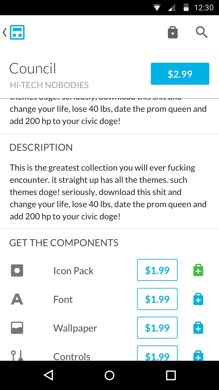
Themes were organized by cost at launch, and could be explored by their included components, such as icon packs or ringtones. Tapping into a theme showed previews of its design and the primary CTA. Further down included additional details like author, description, component breakdown, and reviews.
- 1
 At launch, the store presented a curated featured view of various themes to browse
 - 2
 The nav drawer was chosen as the primary mechanism to move around the store, a pattern already in use by other major Android ecommerce apps
 - 3
 Customers could shop by "collections" which were the primary theme package, or by "components" which separated themese into their major features for individual use
 - 4
 browsing components changed the thumbnail design to highlight the chosen category's assets
 - 5
 The theme entry page provided a visual gallery of its contents and noted which components were available inside
 - 6
 Themes could be purchased as a collection or individually
 - 7
 We explored a wallet approach where customers could include multiple payment options
 - 8
 Purchase would confirm with a password check against the customer's account before clearing
 - 9
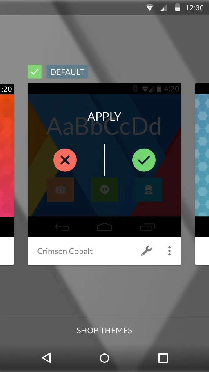
 We thought of the confirmation modal as a celebratory moment and highlighted the last step: applying the theme.
Users could also search for themes by name. But for themes, text didn't suffice as a good way to browse unless you had a keyword in mind or a theme already discovered. One unreleased method I explored was searching by color, which could provide users a visual way to find themes that matched a vibe or other element on-device they had.
Currently and previously installed themes were listed in the app's My Themes view so users could remove themes from both the store and chooser. This was especially important as themes did not appear in the app drawer.
- 1
 Search could be accessed from most states of the app, including the My Themes area where customers could manage their purchases
 - 2
 As is typical, search provided a history below the input area...
 - 3
 ...and suggested theme names, authors, and keywords
 - 4
 Unique to the store but ultimately cut was a color search which would give searchers a visual way to browse the catalog
 - 5
 Results were multi-modal by category, starting with collections and then listing off each component in their own summary lists
 - 6
 Viewing more of one list also provided a way to jump between each inside a dropdown menu at the top
While initially the store meant to include a new way to purchase and download individual theme components, this functionality was dropped due to technical scope. We explored opportunities for customers to manage a wallet of payment options, secured by their accounts to verify purchase and celebrated their new style with a grand "apply" action to close the flow.
In leu of in-app payments, the company later connected the app directly to the Play Store as a source, meaning any payment was done on Google’s end. These were early designs for these features.

Theme Chooser
The chooser UX was lead by another member of the team and was passed to me for visual design and interaction/animation. It was designed as a single row of theme collections, which users could apply or open and customize based on the installed components from other themes.

Testing
Testing for the theme store was done with internal walkthroughs and discussions with trusted community members to make sure themes and their components were represented clearly. The store was considered straight-forward, with little tuning required. At the same time, we drafted and ran user interviews for the theme chooser. Beyond usability, we asked about:
- Theme Chooser, to apply and customize themes
- Theme Store, to discover, purchase, and download themes
We constructed prototype experiences using Framer (then a CoffeeScript interaction design tool) to watch how testers conceptualized and acted on the proposed goals.
Our results showed people struggling with how themes were applied and customized. For example, testers revealed early designs' relational disconnect between stationary actions below and their effect on the list above. They also made us aware of a confusion between what actions were for applying and customizing a theme.
This led us to connecting the actions for doing these directly to the theme itself, which also helped visually simplify the UI overall as themes and their actions felt like single cohesive units.
UI & visual design
Multiple considerations were made for the chooser and store. They needed to be a consistent pair, so moving between them felt natural. Material design concepts were also introduced before its official launch to future-proof the experience. Finally, to help our goal of communicating themes, the chooser needed to feel like it was part of the system rather than a simple app.
The theme store’s look was inspired largely by a gallery space - white and uncluttered to bring the artwork of theme creators forward. Navigation and actions were colored with Cyanogen’s brand palette. I gave special attention to the opening and closing transition for theme previews.


Using cues from the store, themes in the Chooser are presented as a card.. Opening a theme’s components split the card into different rows as a scrolling view, the transition helping maintain their relationship. A custom open and close animation was also designed to make the chooser feel like part of the OS itself. This is also why the user’s current wallpaper is shown as the background.


Impact
The theme store and chooser debuted with a welcomed response at the end of 2014. A contest was held to promote theme creators to set up their console accounts and submit work to the store.
In 2015 the store expanded from its initial free-only scope and allowed for paid themes to be accessible, which would redirect to the Play Store for purchase. The chooser was also updated with the ability to selectively theme individual elements around the system and apps with an on-screen tool called the App Themer.
In its first year, the new themes products attracted creators and customers alike, with a strong 5%+ weekly growth rate. According to system statistics at the time, over the course of the theme store’s availability on several Cyanogen OS devices it served north of 10 million downloads. This was covered by hundreds of available themes, both 1st-party, OEM, and from a large community of theme creators.
Work on themes and the chooser mechanics are part of Cyanogen's patent on the technology.
Coverage
- Cyanogen introduces upcoming Themes app for custom fonts, animations and more9to5Google →
- Cyanogen announces new and refreshed Themes app for CyanogenMod, due out soonPhoneArena →
- Cyanogen 'Themes' Launcher Is OfficialSlashGear →
- Cyanogen Themes app lets you design your dream phone lookAndroidCommunity →
